Data Visualization in R - ggplot
Published:
In my data visualization course, my project partner and I evaluated data related to the Portland Trail Blazers and Golden State Warriors. Here are a few graphs that I created during this project. Graphs were created using ggplot2 in R. Data was sourced from Kaggle for seasons from 2010 - 2022.
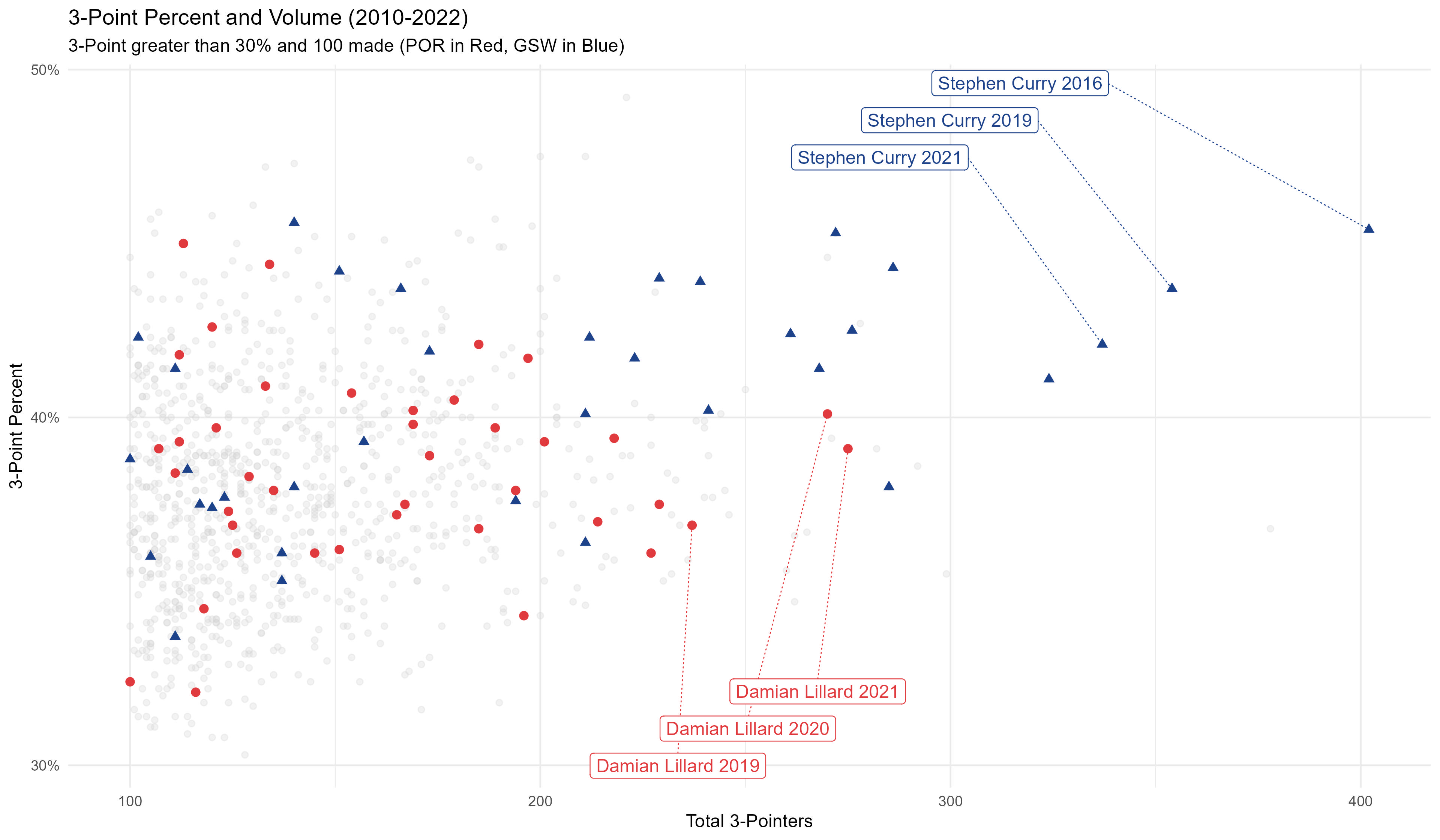
- Will lead off with one of the graphs I am most proud of. I think it tells a really cool story about the state of the NBA in relationship to the 3-point shot while also highlighting the next-level performances of Damian Lillard and Steph Curry
Historic performances by Damian Lillard and Steph Curry
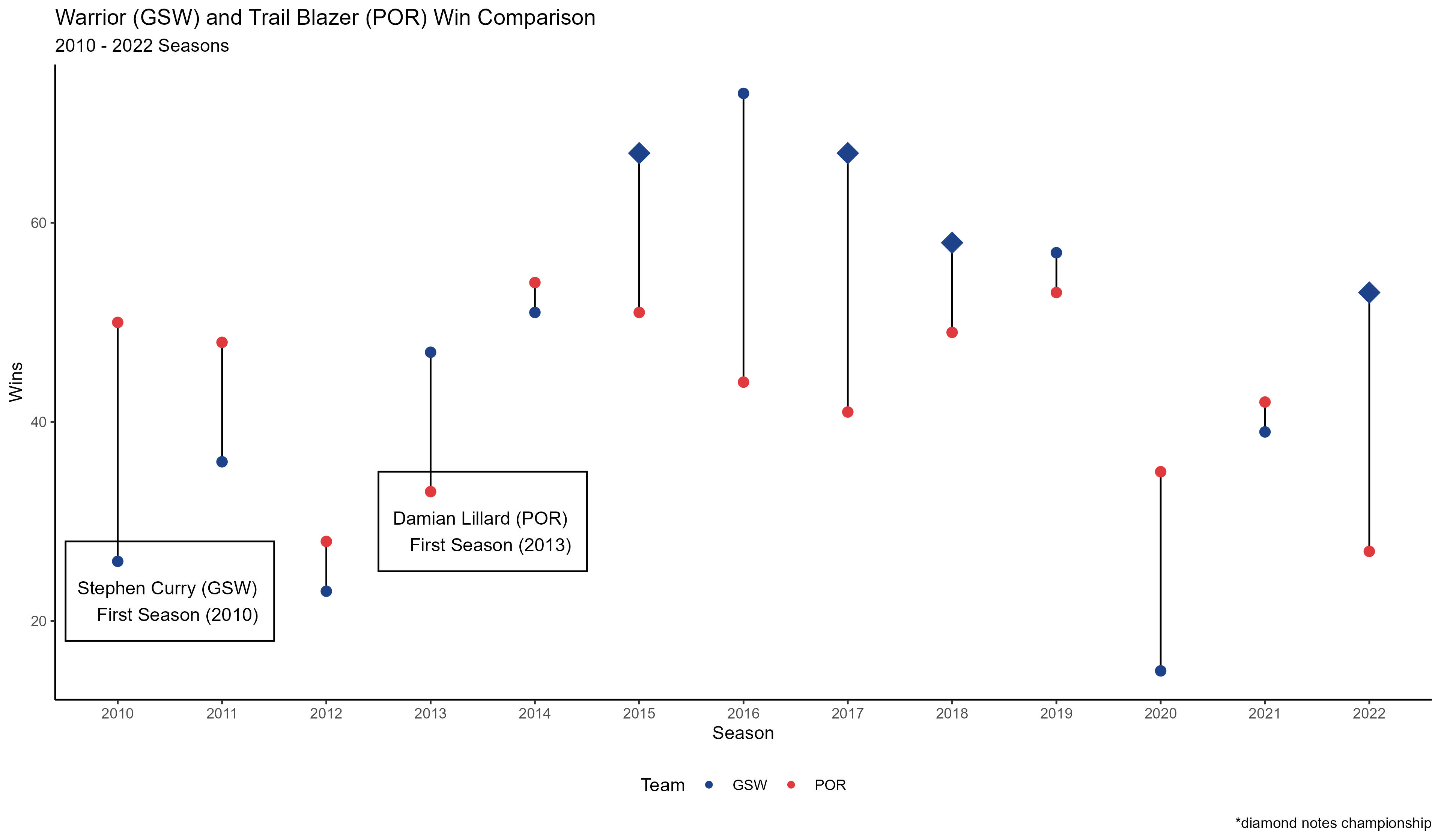
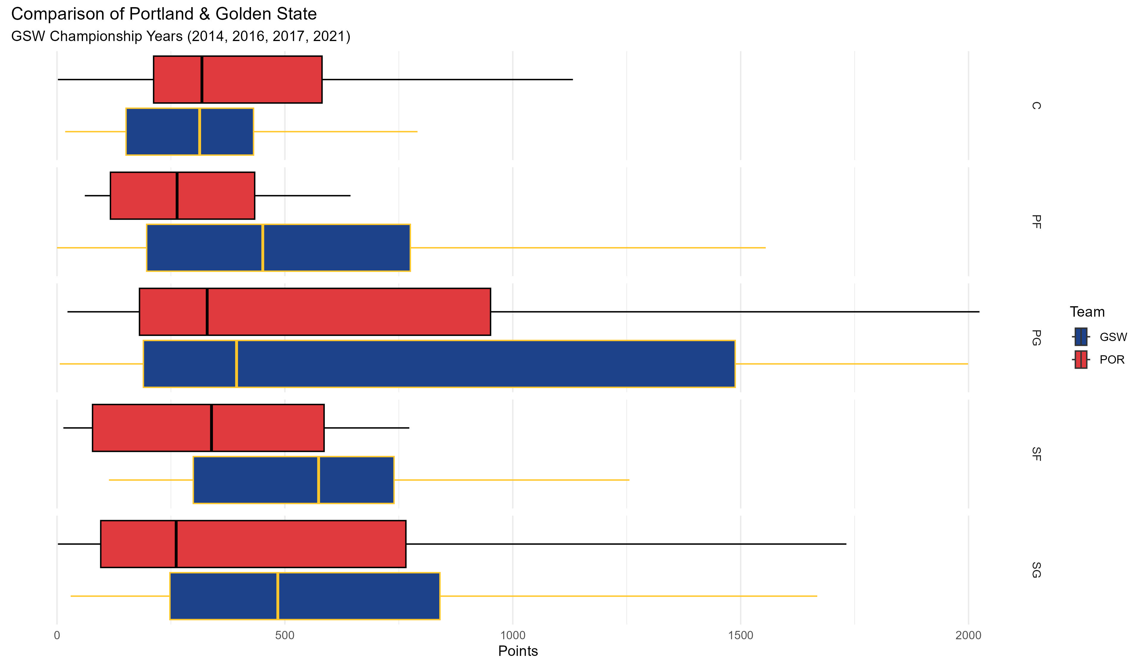
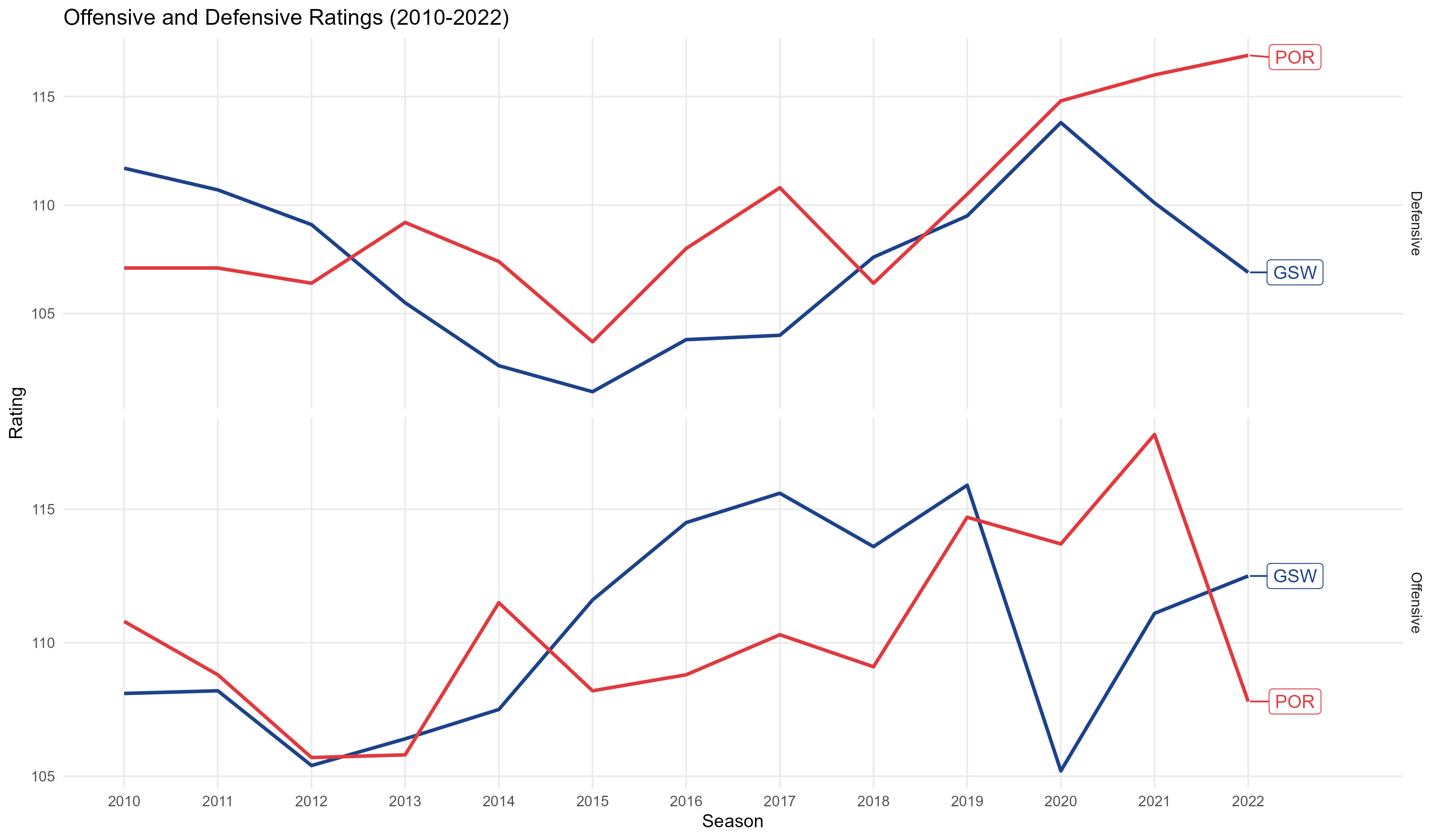
- Here are several other visuals that we produced for this project. There was extensive experimentation with the code to allow us to tell a cool story that contrasted these two teams.
Comparing overall season outcomes for the Blazers and Warriors:
Comparing points by position in years where Golden State won championships:
Reviewing the offensive and defensive ratings of the Blazers and Warriors from 2010-2022:
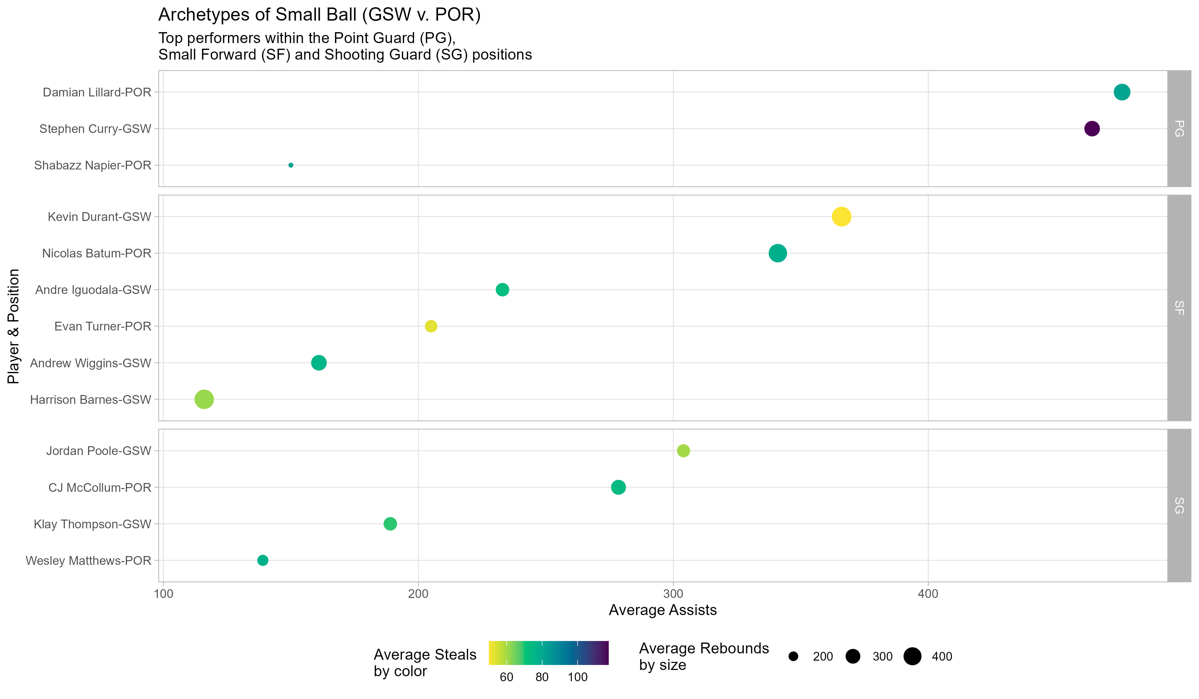
Evaluating the small ball player archetypes: